6 steps to the perfect Patreon About Page

Many game developers use Patreon as a tool to get support from their fans, but a poorly constructed Patreon About page is a waste of effort and can result in the player never getting to really play your game.
That's why we've put together this quick guide, which, with simple actions, will help you build a page focused on getting more supporters for your game.
First, let's get some basic rules out of the way.
Make it as simple as possible: Every click counts. The more clicks a player has to make to get to your game, the further they are from playing your game and becoming a Patron.
Help them stay focused: Don't send them to links that will take their attention away, like YouTube, social networks, etc... These sites offer A LOT of distracting content, You had a lot of work to get them to your page, so don't throw them back to social networks.
Organization and beauty: The vast majority of people won't read 100% of the content on your page, so organize the content in a simple and attractive way, according to the player's expectations, not yours.
Now let's get to work, the perfect structure for your Patreon page.
Step 1
This is the most important part of your About page, because you need to give the player what they are looking for immediately, your game, otherwise they will close the tab and look for something more interesting in the other 42 tabs that are open.
The best way to do this is to use images as buttons on Patreon.
If you don't know how to create one, you can download our buttons from the Assets link at the end of this post.
All buttons must have a CTA (Call to Action) where you tell the player to do something, not suggest it. Use verbs like "Play now", "try now", "support now", etc...
If you have a free version of your game, always offer the paid and most up-to-date version first, then the free version and only lastly offer a Discord link. (If the player doesn't want to download it now, he also has the option of joining your discord, this gives you a direct channel of communication with him to convince him to download your game in the future.)
Example:

Step 2
Use text separators such as *** or ___________________ to better organize your layout, no one likes to read cluttered, messy text.
Step 3
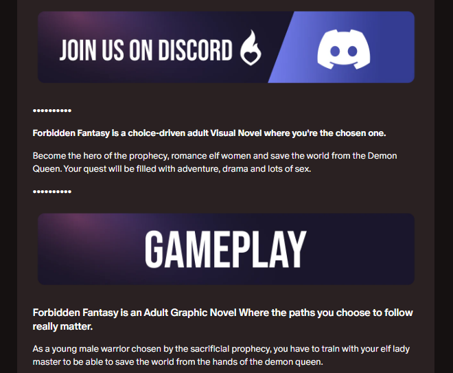
Summarize your game with a title and a paragraph; always highlight the title using bold. But this description can't be about 5 lines long, otherwise many people will stop reading halfway through, so try to be direct.
"My game is a..... and in this game you will find.... this game is fun, sexy, catching, etc.... ."
Example:

Step 4
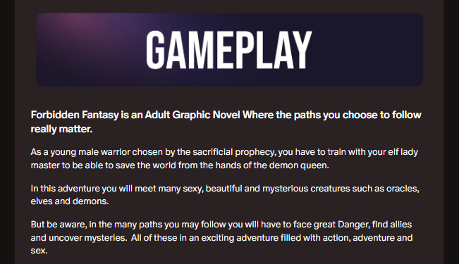
If your player has made it this far, it means he's willing to devote a little more attention to your game, so it's time to give him more details.
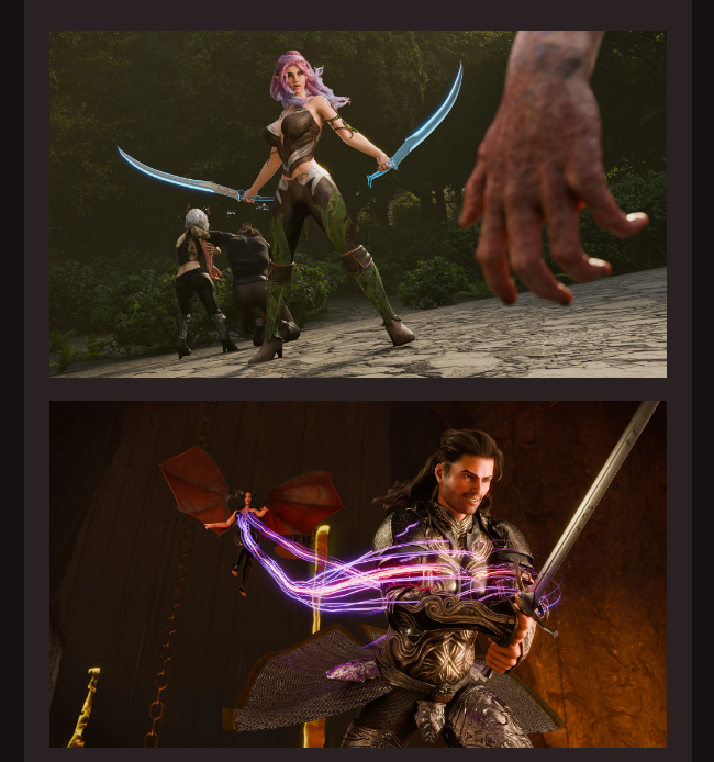
So here you can dedicate 3 more paragraphs (short and organized) about the gameplay, followed by some screenshots (SFW).
You can also use images with large titles to help the player find the information faster. If you don't want to create one, you can use ours in the Assets link at the end of this post.
Example:
Step 5
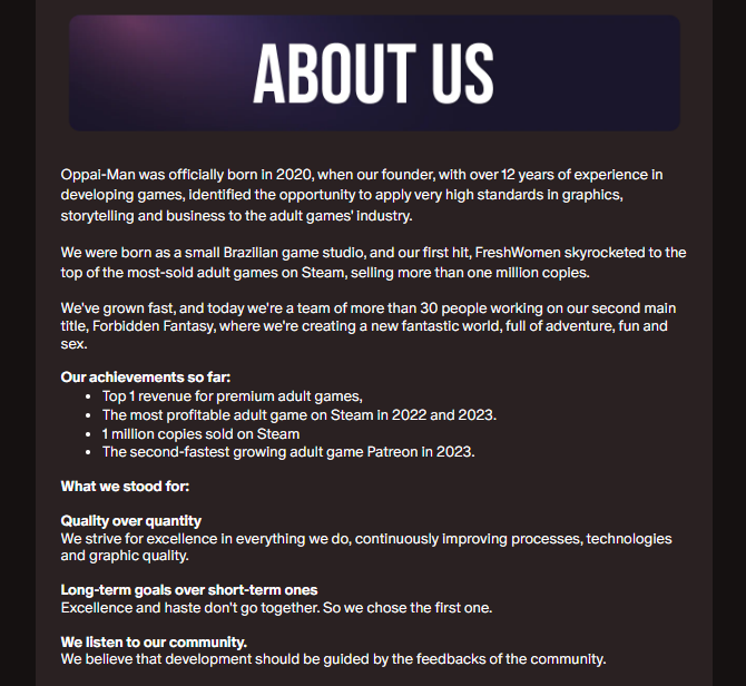
After detailing your game and your project, it's time to tell the player a little about yourself or the team behind the development.
You can answer questions like:
Who are you?
What is your main motivator?
What are your long-term goals?
What sets you apart from other games?
Why should the player support the project?
Example:
Step 6
After that, you can add more screenshots and repeat EXACTLY the same buttons as at the beginning of the page. (CTAs are never too much).

Download Oppaiman Assets here.
This post was based on Forbidden Fantasy Patreon page, you can check-it here
That's it guys, if you like this post please consider subscribe for more content like this.
